-
Infinite Scroll
We’ve now added the ability for continual scrolling on our post pages. This will help for those inspiration hunts, where you obviously don’t want to keep pressing the ‘Next’ page buttons and then wait for everything to load. Enjoy!
-
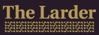
The Larder
Company have created this distinctive identity for The Larder, a modern British restaurant, bakery and delicatessen in London’s Clerkenwell district. Inspired by traditional British values, they used simple serif typeface, and a rich gold and deep aubergine colour scheme, which was supported by an ornamental pattern, to create a look that is classic yet contemporary. […]
-
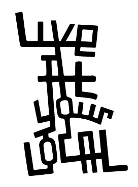
Live At Your Local
Company created this branding for Live At Your Local, an entertainment guide for London’s Islington and Hackney neighbourhoods, including a website and print applications. The concept behind the logo was… “Building on the core notion of local community, we designed the logo as a series of interconnecting streets, based on a map of the area.” […]
-
ParkSlide
Alan van Roemburg created this logo for  ParkSlide. The company: ParkSlide connects people via a web-delivered video conferencing system. The concept: The two intersecting discs are a typographic abstraction of the letters P & S, whilst at the same time the silhouettes create the shape of two people / faces connecting. You can view the project […]
-
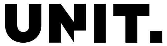
Unit
Jenny Theolin over at Graphic Drip created the branding for Unit, a Swedish advertising agency. She gives the lowdown on the branding here: “The logo was designed to reflect various definitions of Unit: • An individual, group, structure, or other entity regarded as an elementary structural or functional constituent of a whole. • A group […]
-
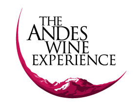
The Andes Wine Experience
Logo for The Andes Wine Experience, created by Monoblock
-

Plancast
Alex over on the Iso50 blog, created this logo for Plancast – a website that helps your broadcast your upcoming plans to your friends. He’s also helpfully included a full run down on the development process in great details for everyone here to view, which helps explain the concept of the penguin in detail.
-

Lift
Nice little logo for Dallas bar, Lift. Designed by Banowetz + Company.
-
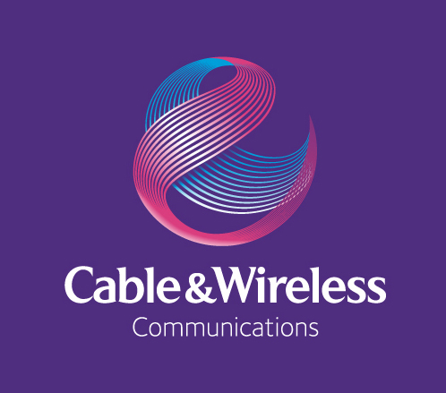
Cable & Wireless Communications
New logo for one half of a demerger for Cable & Wireless. Features a progression of the old globe logo, using lines to create the 3d spear. You can view the these lines being pushed further in illustrations on their website: Press release from Cable & Wireless Communcations about the brand launch. Article on Creative […]
-

Lloyds Banking Group
A new brand was created in January 2009 as the group which looks after all their banking brands. It features the horse from their usual Llyods TSB branding, but with a more stylish look and feel incorporating the clean typography. Horizontal version of the logo: Annual Report: Website: View Lloyds Banking Group’s website.
-
404 Issues (Fasthosts/WordPress Bug)
Sorry if people have had issues with the 404 page behaving oddly of late… It seems it was a problem with a bug with the way 404 pages for WordPress work on the Fasthosts servers (it causes only some of the page to be displayed). However, we found a fix, which is a very strange […]
-
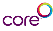
Core
Brand and brand materials for Core, a Scottish Power company, designed by Good Creative. The concept is explained on the Good Creative site: Core, a subsidiary of Scottish Power, delivers gas, electricity,telecoms and water through one track/pipe. This concept of four utilities in one seemed a powerful metaphor for teamwork and unity, a much needed […]
-
Logo
First published in 2007 by Laurence King Publishing, Logo by Michael Evamy, spans around 352 richly illustrated pages and is often referred to as a “logo bible” – a fitting description for such a comprehensive reference. Rather than serving as a “how-to” manual, the book is structured as a visual exploration, showcasing over 1,300 logos […]
-
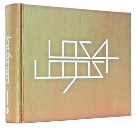
Los Logos 4
Los Logos 4 is a comprehensive volume that showcases the latest developments in contemporary logo design. With over 5,000 examples, it serves as an essential resource for designers seeking inspiration and insight into current trends. The book is organized thematically, drawing connections between applications and the fields for which they were intended, making it a […]
-
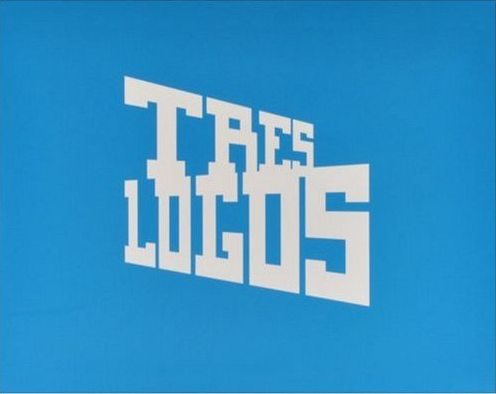
Tres Logos
Logo design is an ever-evolving craft, and Tres Logos stands as a definitive visual encyclopedia of its modern landscape. Building on the legacies of its predecessors, this book showcases over 4,400 examples from designers worldwide, exploring how contemporary influences like illustration and street art are shaping the field. This volume is more than a simple […]
-
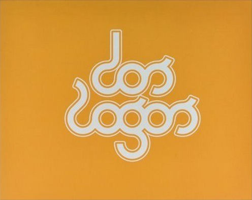
Dos Logos
Dos Logos, a best-selling visual encyclopedia of logo design, is now available in an accessible softcover edition. This essential resource for designers features a condensed edit of the popular hardcover book, providing over 2,300 new examples and a wide array of stylistic approaches to logo creation from international designers. It’s a key sourcebook that charts […]
-
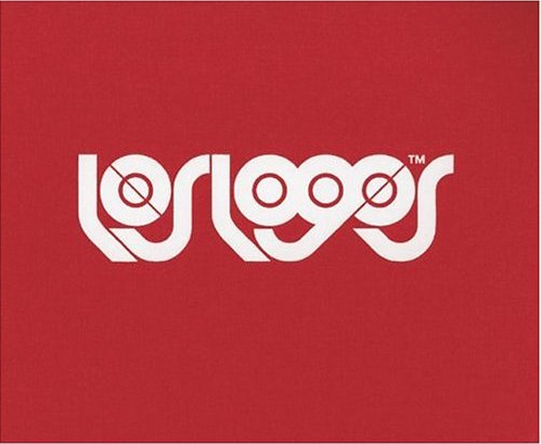
Los Logos
Los Logos is a substantial volume that provides an incredible overview of contemporary logo design. The book showcases the work of designers from around the globe, proving that the deceptively simple task of creating a logo is one of the most challenging in graphic design. By distilling an image or message into a simple, recognizable […]
-
Undergoing a facelift!
Hi all, the Logoed site maybe looking a little odd for a short while we transfer to new systems…Â But all content is still accessible. We’ll be back to normality very soon x
-
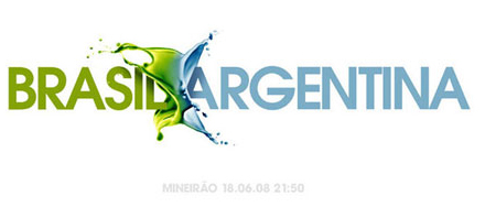
Brasil Argentina
-
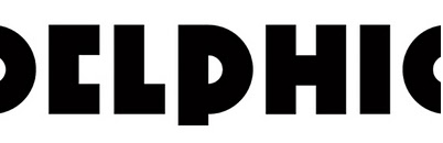
Delphic
Ident for band Delphic. The album/singles sleeve artworks produced by Non-Format is also equally fantastic, with photography by themselves & Jake Walters…