
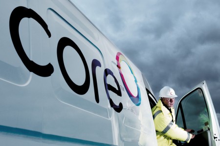
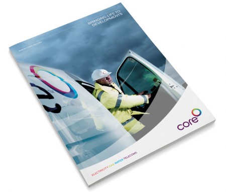
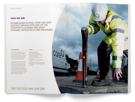
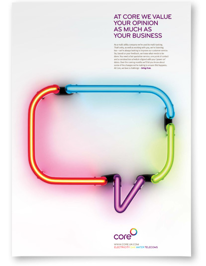
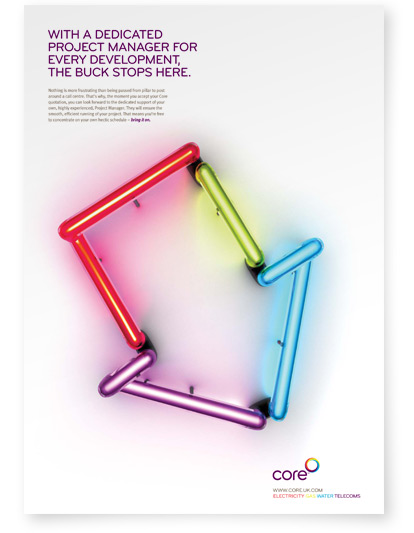
Brand and brand materials for Core, a Scottish Power company, designed by Good Creative.
The concept is explained on the Good Creative site:
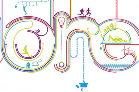
Core, a subsidiary of Scottish Power, delivers gas, electricity,telecoms and water through one track/pipe. This concept of four utilities in one seemed a powerful metaphor for teamwork and unity, a much needed quality as Core faced a difficult trading period.
Full info can be found here, and here are some of the branding usage examples they produced…



Leave a Reply