Unit

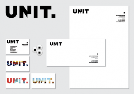
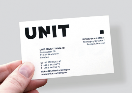
Jenny Theolin over at Graphic Drip created the branding for Unit, a Swedish advertising agency.

She gives the lowdown on the branding here:
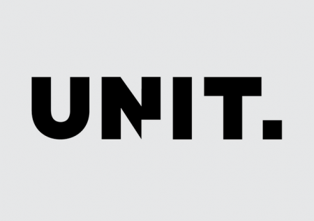
“The logo was designed to reflect various definitions of Unit:
• An individual, group, structure, or other entity regarded as an elementary structural or functional constituent of a whole.
• A group regarded as a distinct entity within a larger group.

The square represents that constituent and will be used on various applications.”


Posted

in

by

Tags:

Comments

5 responses to “Unit”

  1. adolf Avatar
    adolf

    shame they didnt use the dot of the ‘I’ instead

  2. Mikie Avatar
    Mikie

    I feel they were right to use the corner of the ‘N’ as otherwise, there wouldn’t have been anything distinctive about it.

    In fact… it’s in capitals, so there wouldn’t be a dot above the ‘I’ anyway.

  3. Ehsan Avatar

    That’s right and they designed it very unique, i like that dot and its very useful in any kind of products for advertising. its good work but i dont like black for logo color, its raw! 🙂

  4. pengpeng Avatar
    pengpeng

    thank you ~~

  5. logotipo Avatar

    Great Logo!

Leave a Reply

Your email address will not be published. Required fields are marked *