![]()
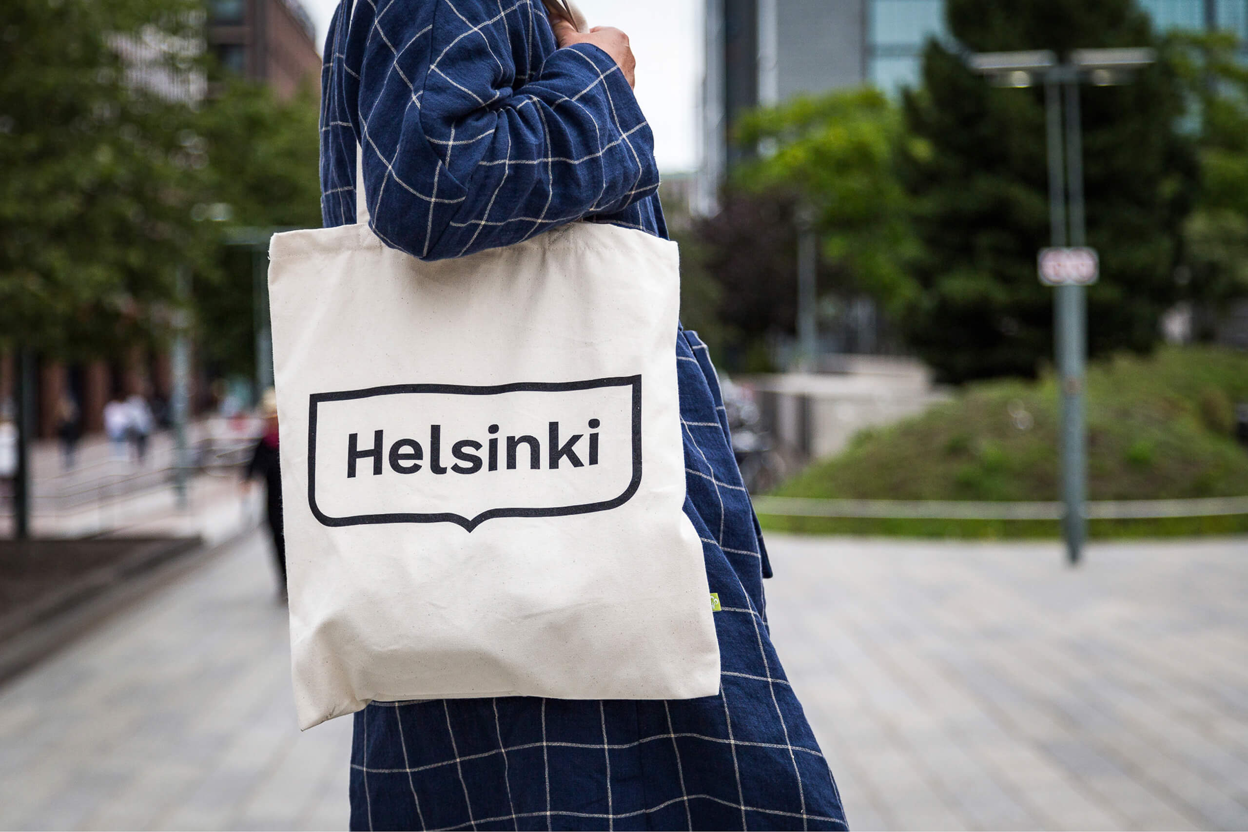
New identity for the City of Helsinki. The Finland capital’s rebrand was completed by Werklig.
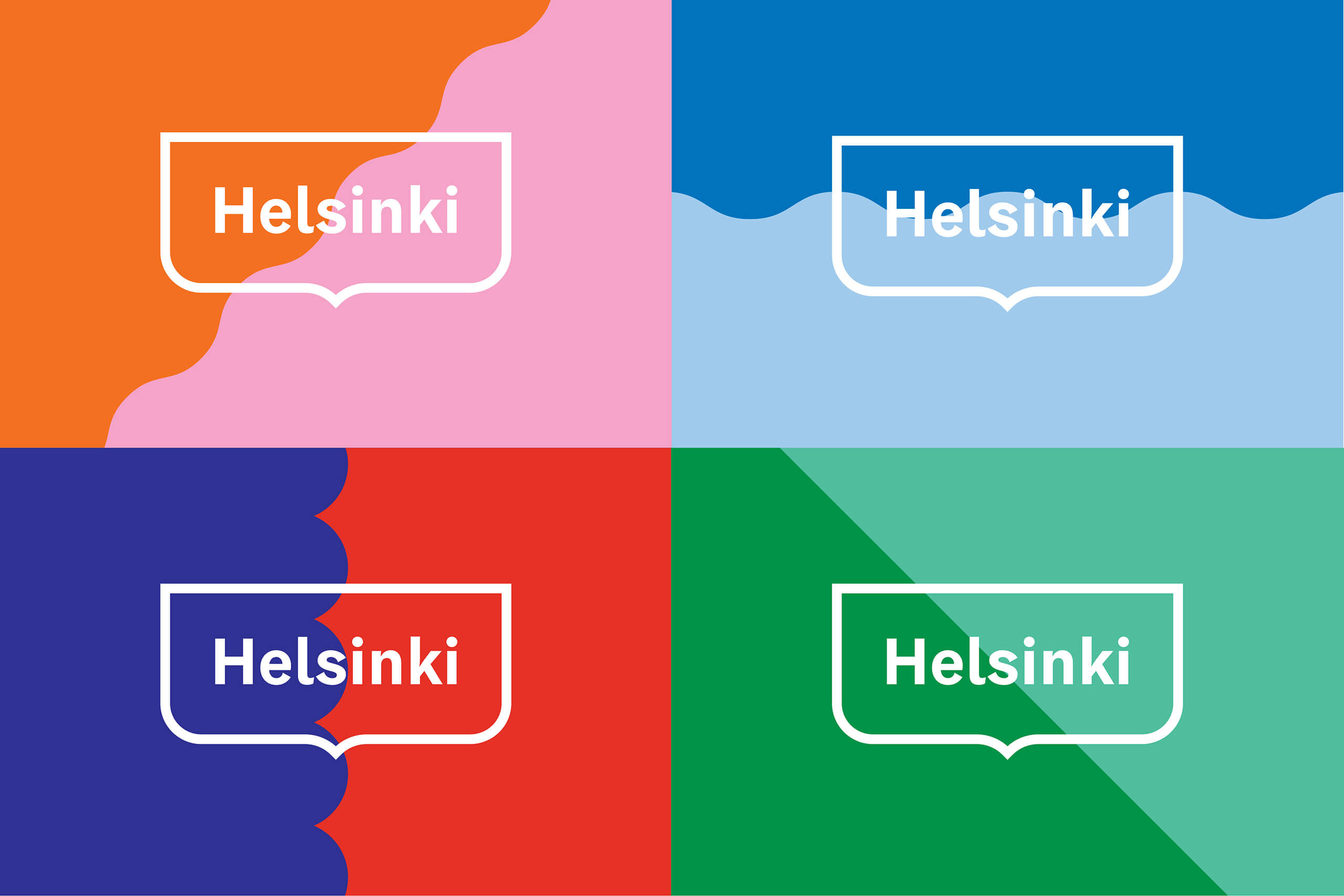
“The City of Helsinki had no uniform brand identity and city departments and projects have had their own varying identities and logos. The only consistent identity element was the Helsinki coat of arms but it had its own restrictions and challenges in terms of usability.”
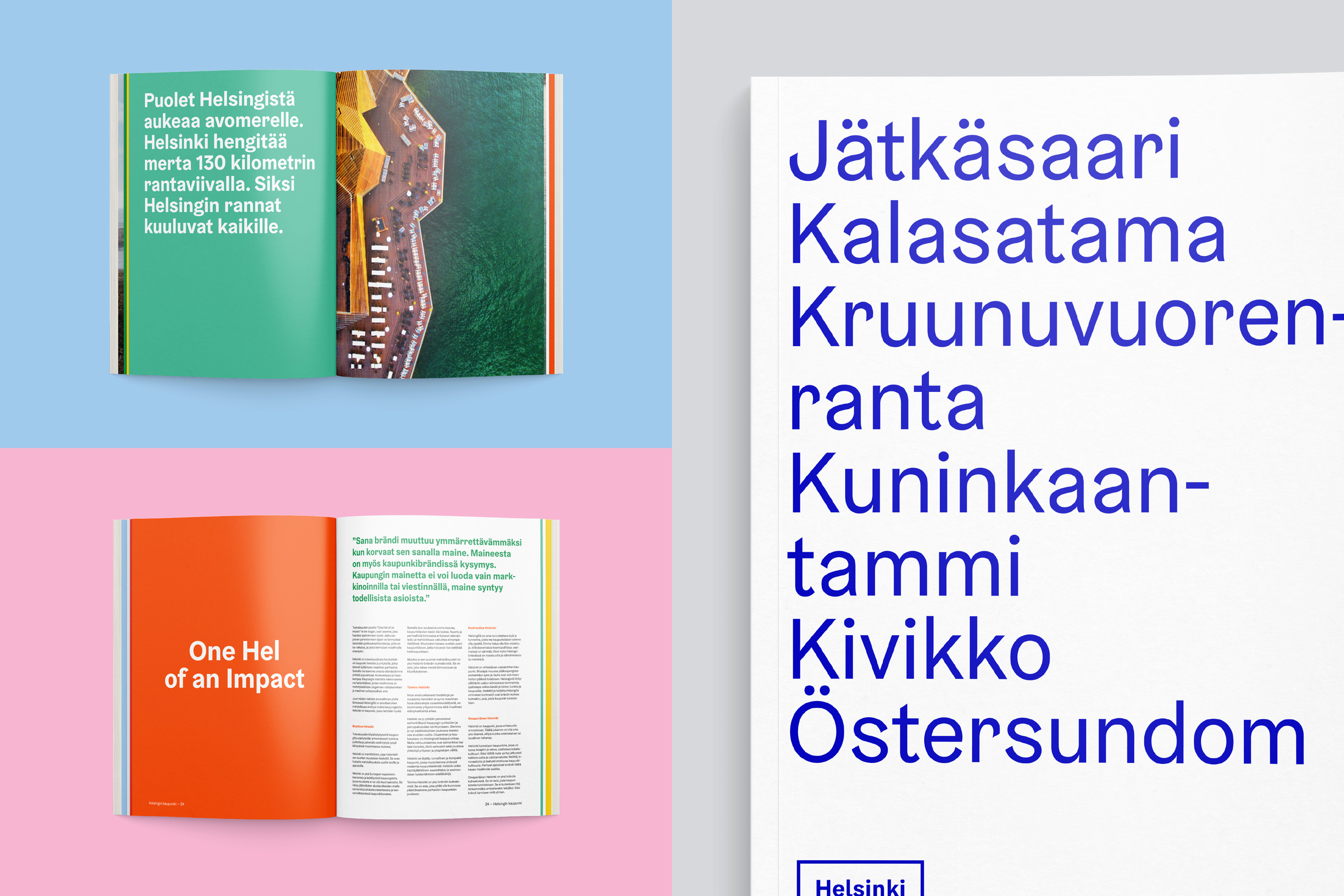
“The reform of the City organization offered an opportunity to unify the City’s brand into one cohesive visual identity.” – Werklig
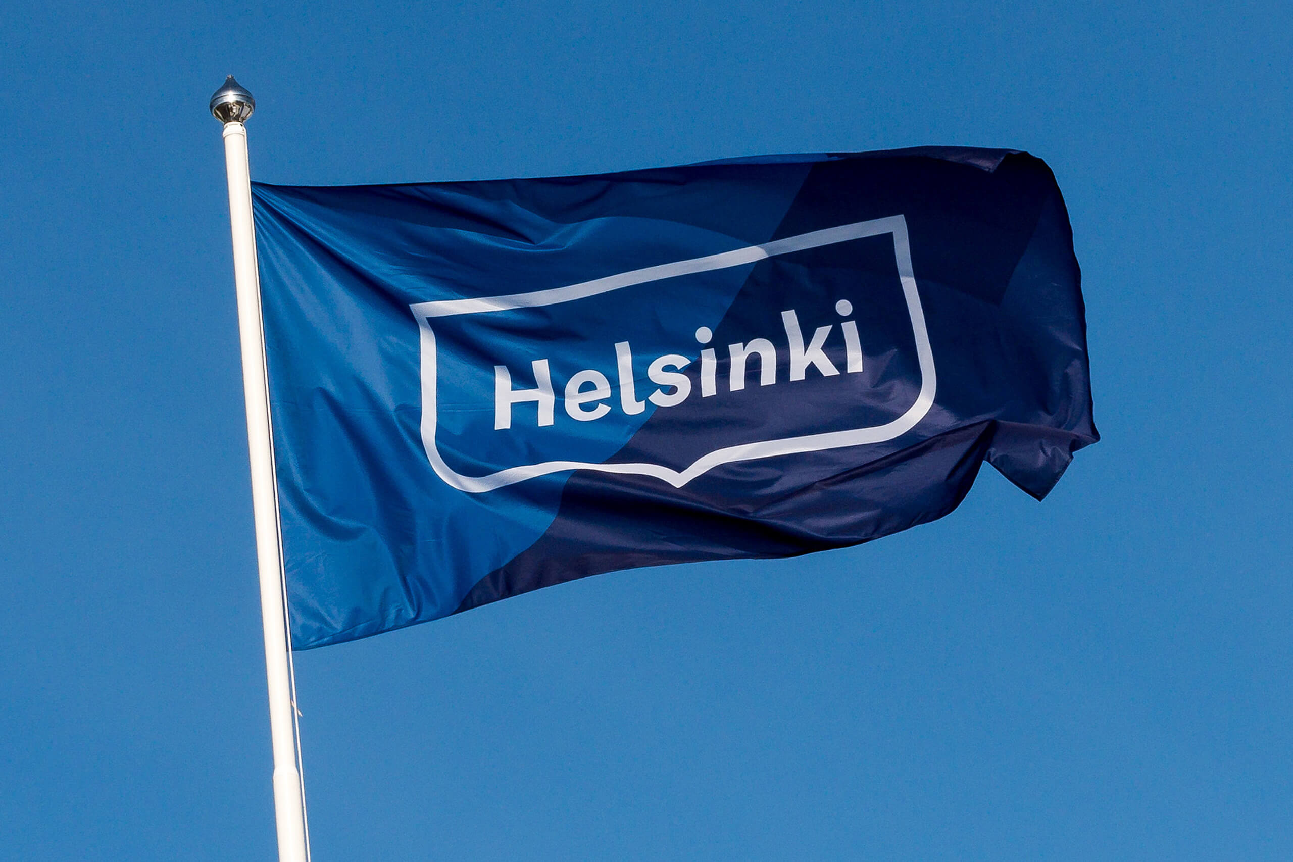

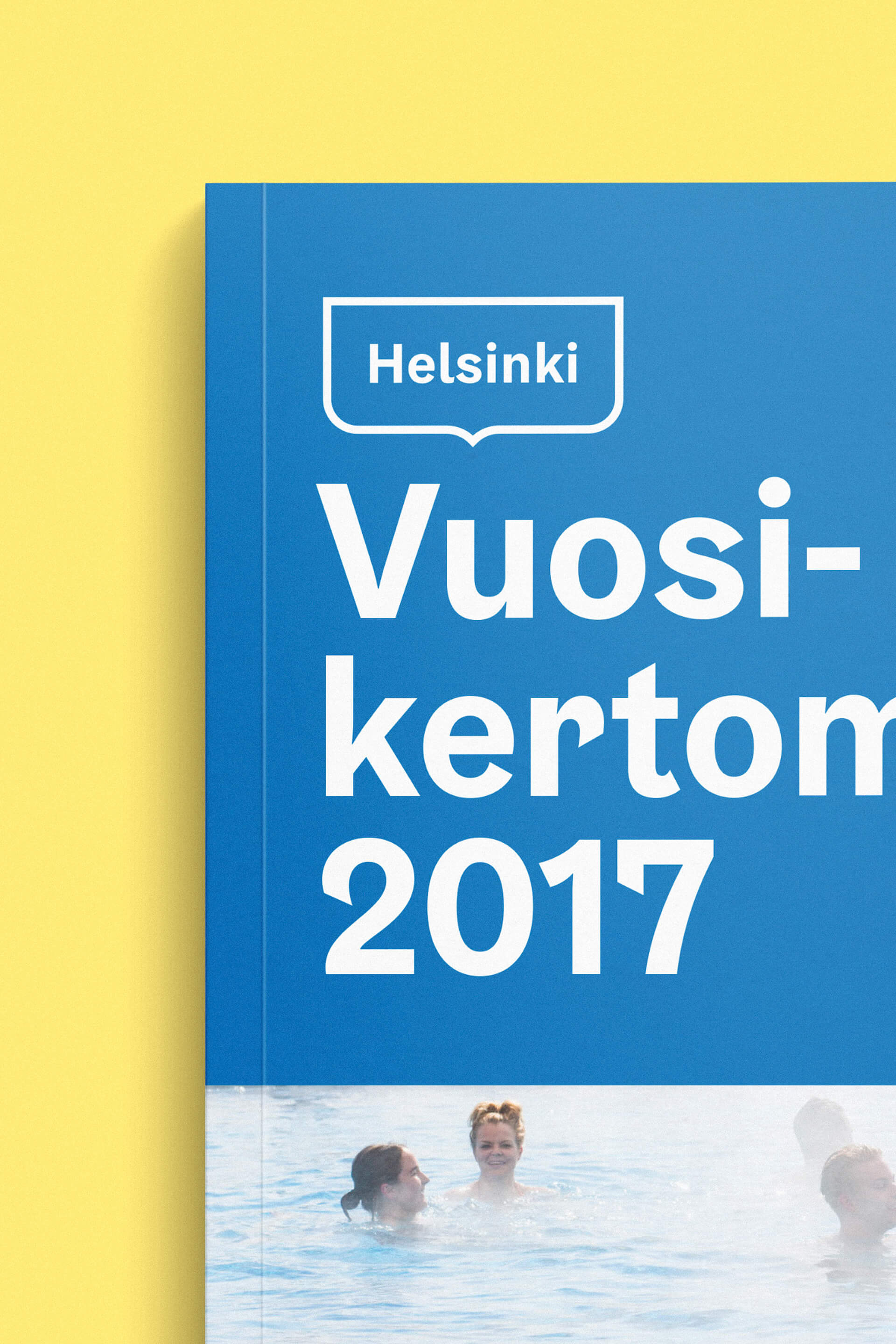
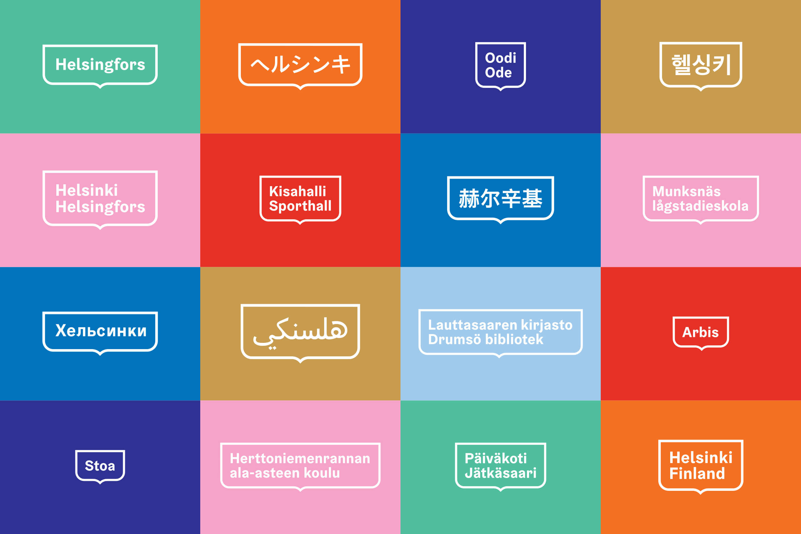
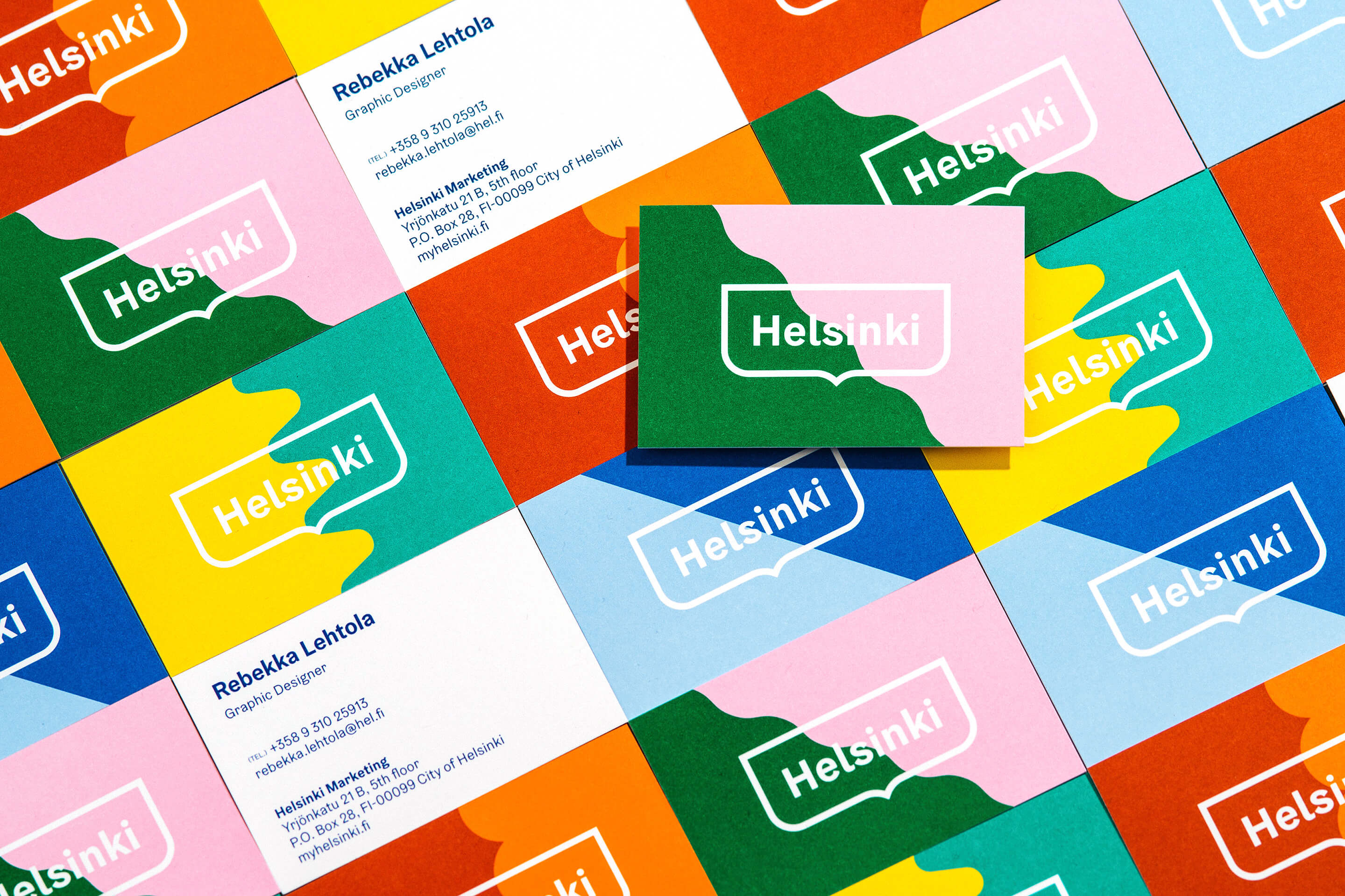
“The spearhead of the identity–Helsinki logo–was designed based on the most recognisable Helsinki symbol, the traditional Helsinki crest. The new logo was designed to be adaptive and responsive to any content, for example, different language versions of the logo.”
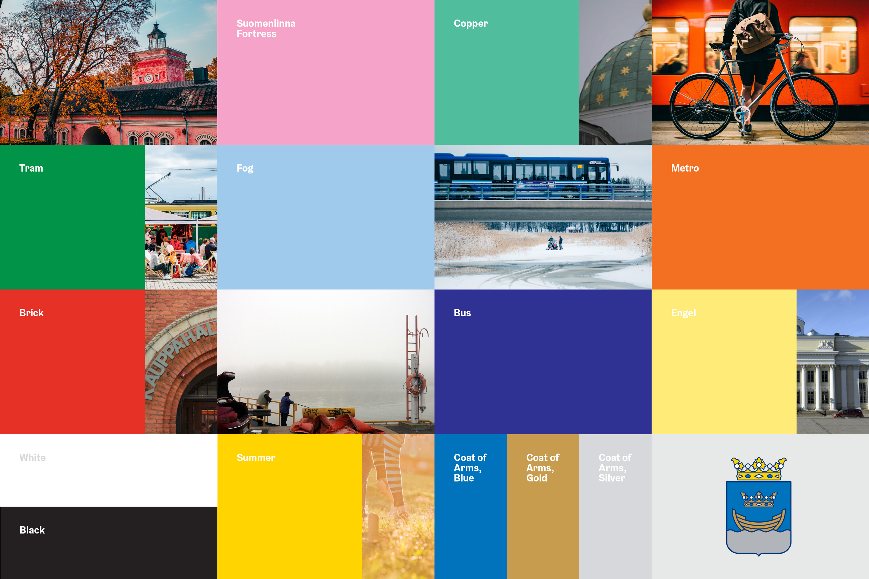
“The graphic wave motif (and its variations) used as a graphic element was also derived from the coat of arms.” – Werklig
Leave a Reply