The Swan & Mallard
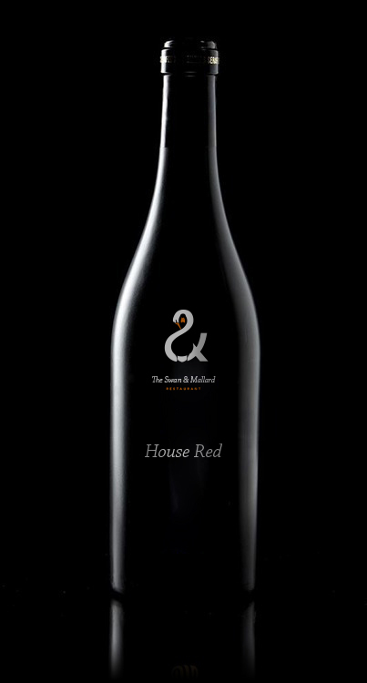
The Swan & Mallard Restaurant by John Randall.
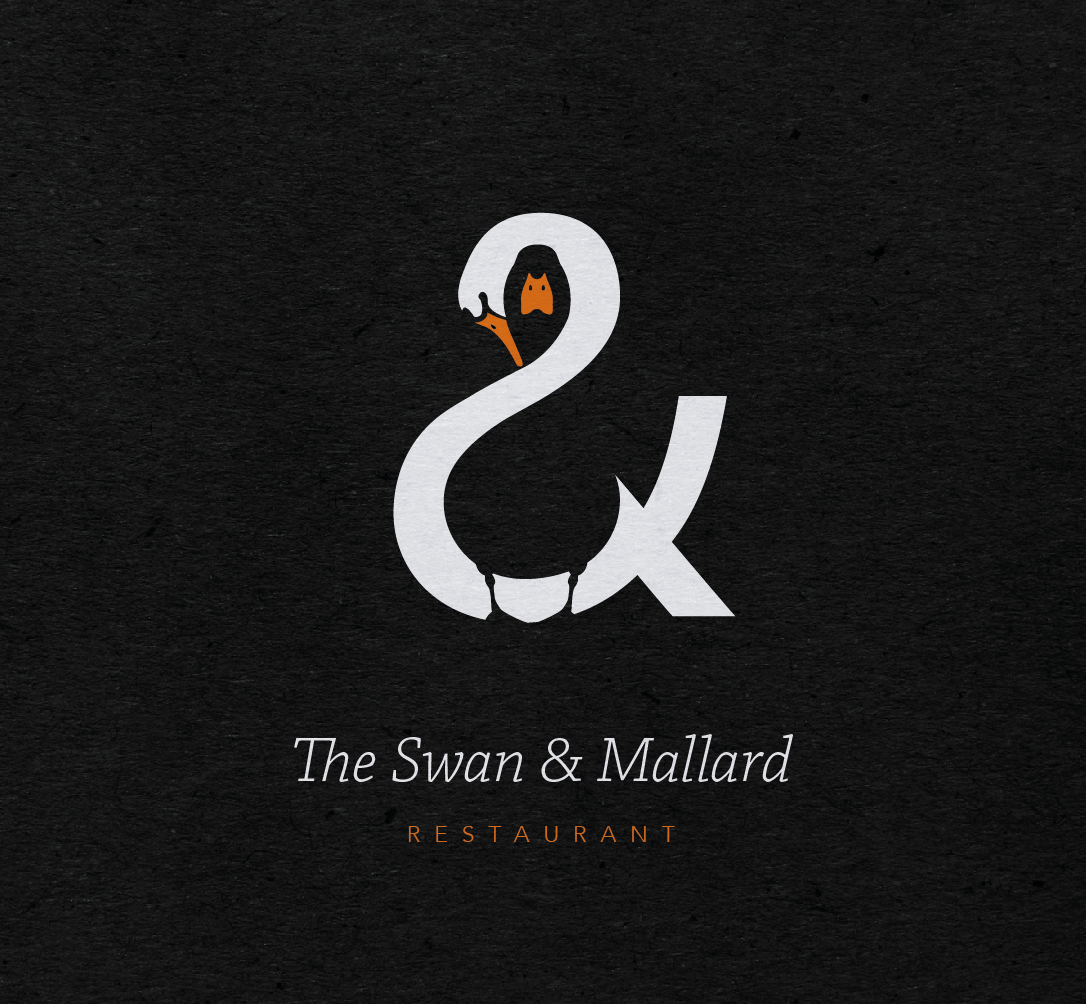
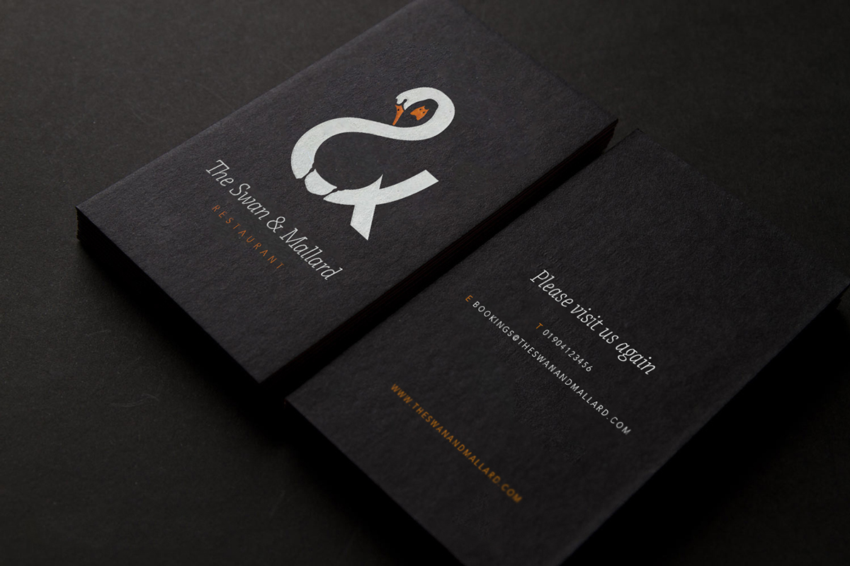
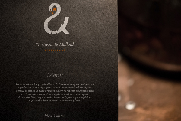
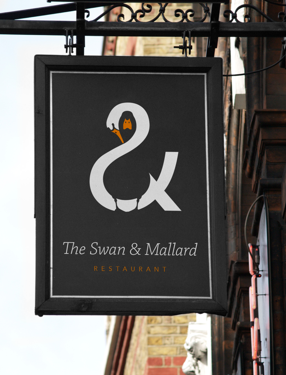
“The identity plays upon the three aspects of the restaurants name by unifying the swan and the mallard through the positive and negative space within the ampersand. A limited colour palette and minimalistic style helps create a simple yet balanced feel.” – John Randall
September 10th, 2015 at 11:04 am
It is impressive how a touch of orange colour could break the monotony between black and white.
Great work, indeed!
December 2nd, 2015 at 8:35 pm
Wonderful ,absolutely wonderful!
February 4th, 2016 at 3:53 am
I dont get it.
April 1st, 2016 at 9:40 am
Beautiful, gEnious…, i love that the mallard takes over the object, it become the bottle or the board, it become beautifully integranted in the background or object, and brings its force
January 17th, 2019 at 2:05 pm
BEAUTIFUL!
April 24th, 2019 at 9:02 pm
LOVE IT! Truly beautiful!
October 24th, 2019 at 3:07 pm
This is great!
February 8th, 2020 at 5:09 pm
Will be the envy of many graphic artists. One in a million!
February 10th, 2020 at 7:34 am
Not great in its current form. The swan is partly a realistic swan, partly an ampersand, with an abrupt and jarring transition (or rather lack thereof). The mallard’s legs are too scrawny compared to the rest of the design, so they are mostly lost. A few more dozens of iterations could have likely got you there.
October 12th, 2020 at 3:40 am
EXCELLENT JOB!
July 15th, 2021 at 12:58 pm
Thicker Mallard legs
Bigger Mallard Head
Swan should have its tails (in the shape of the ampersand) feathered or textured, and on the left hand side of the swell of the chest, some feathered detail) and the whole swan/ampersand to be a little bigger to accommodate the larger head detail of the mallard (there needs to be more space for the mallard beak to be bigger and more easily identifiable as its face)
IMHO