![]()
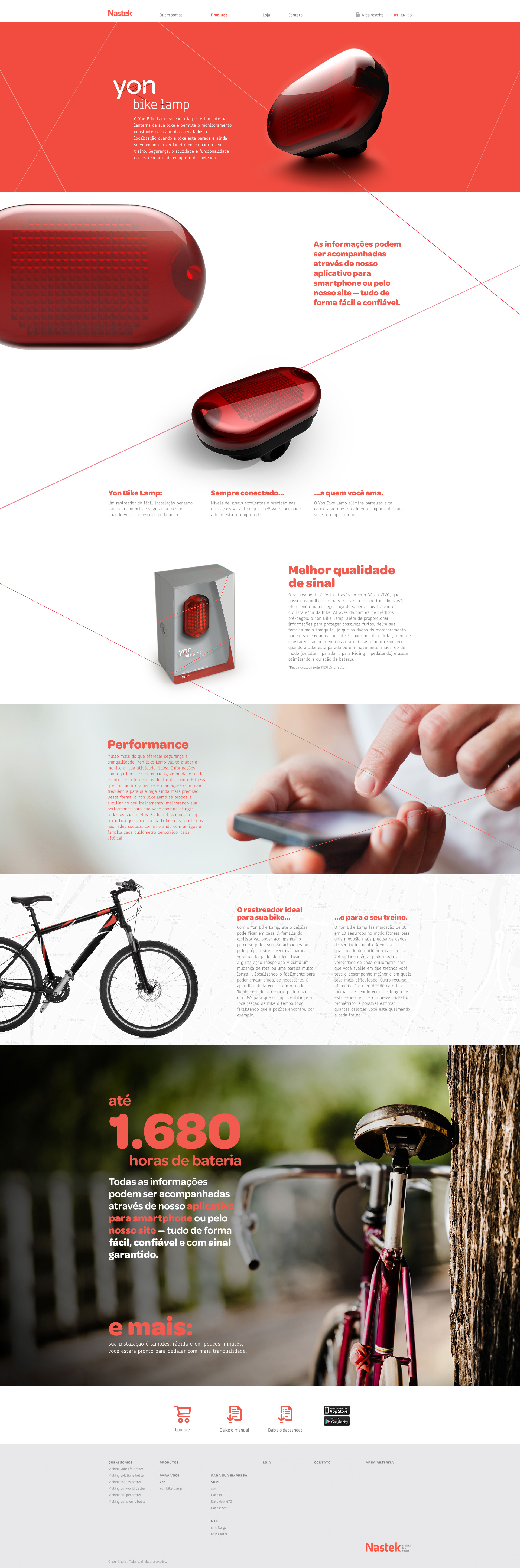
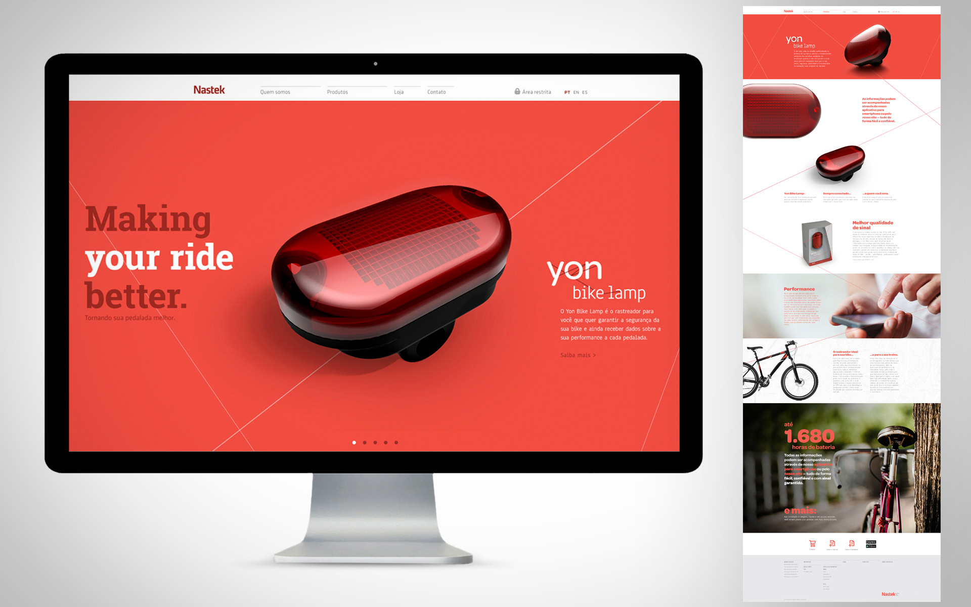
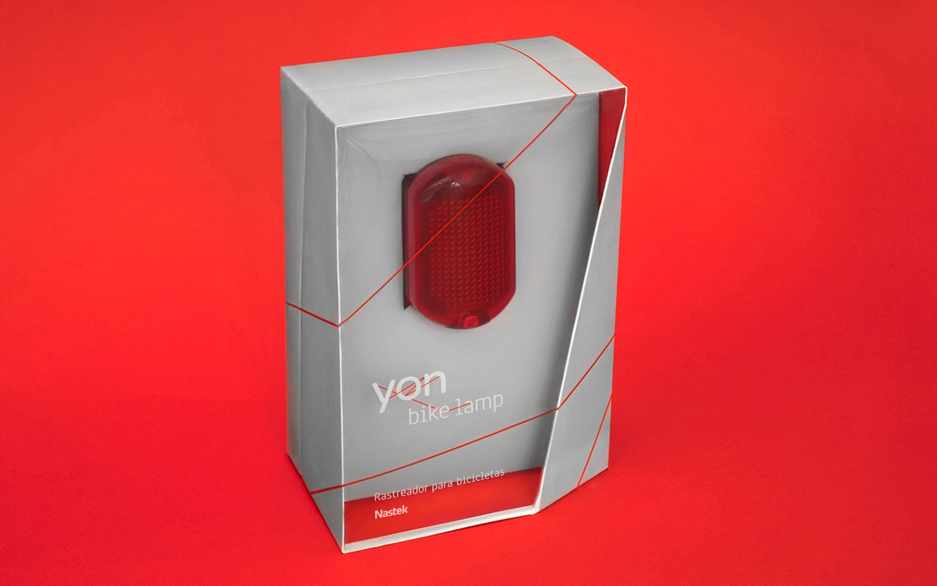
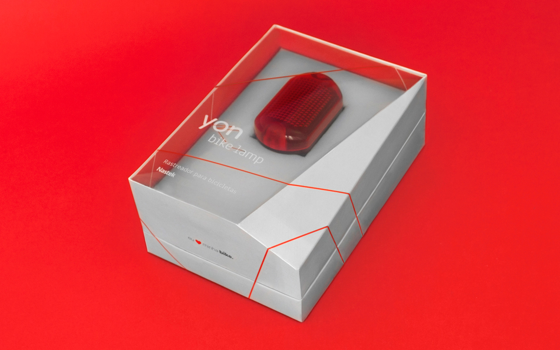
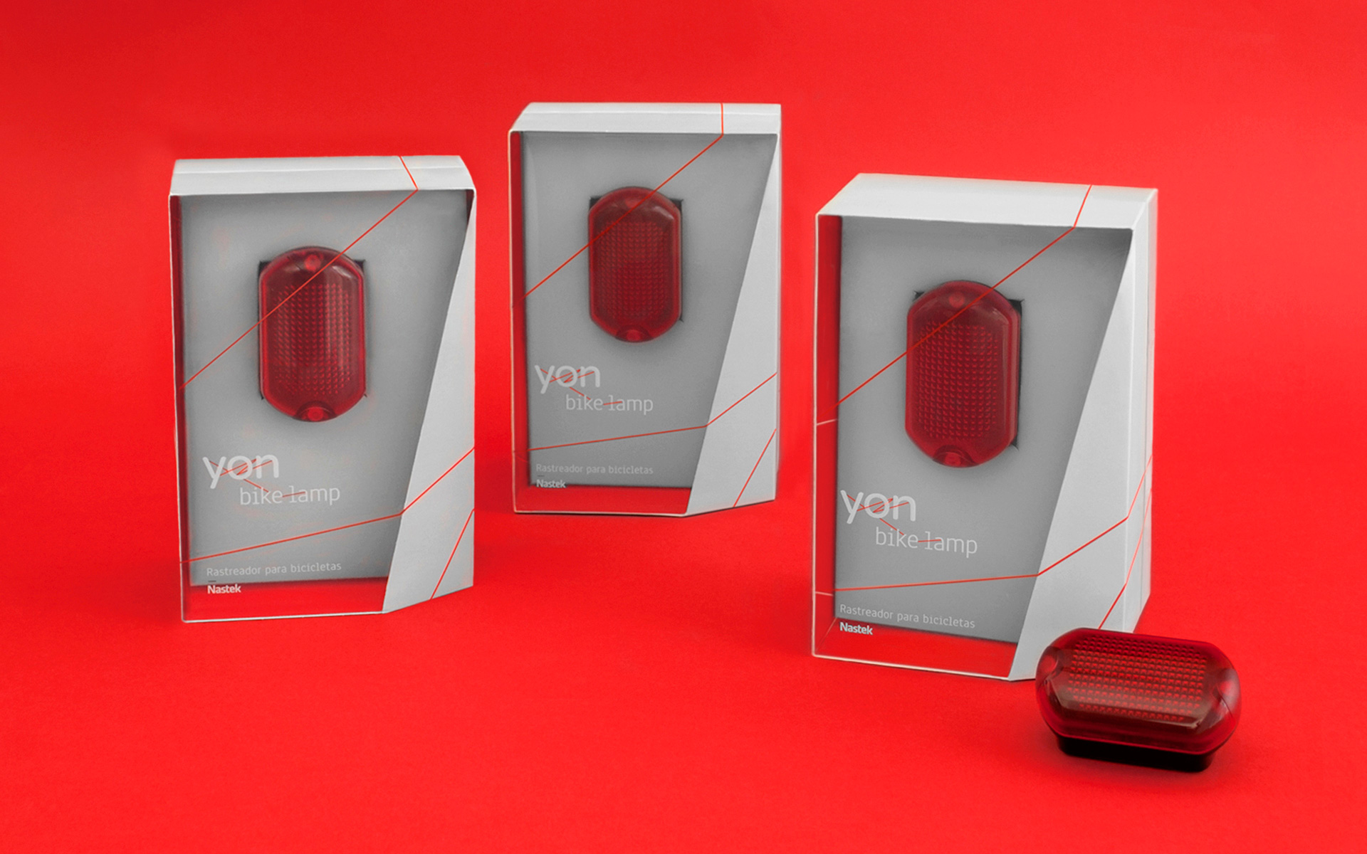
This great identity for Nastek’s Yon product line was completed by Saad in Brazil.
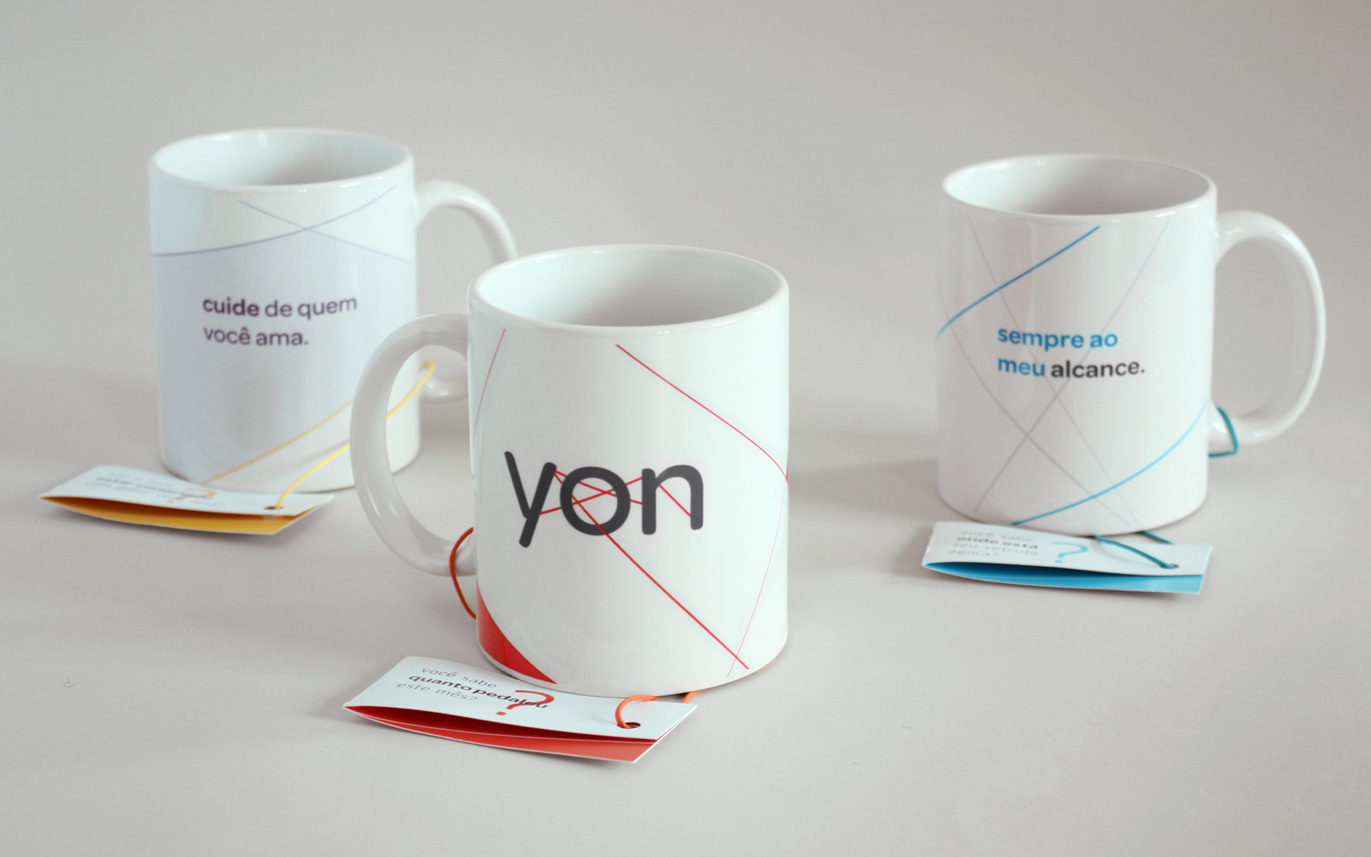
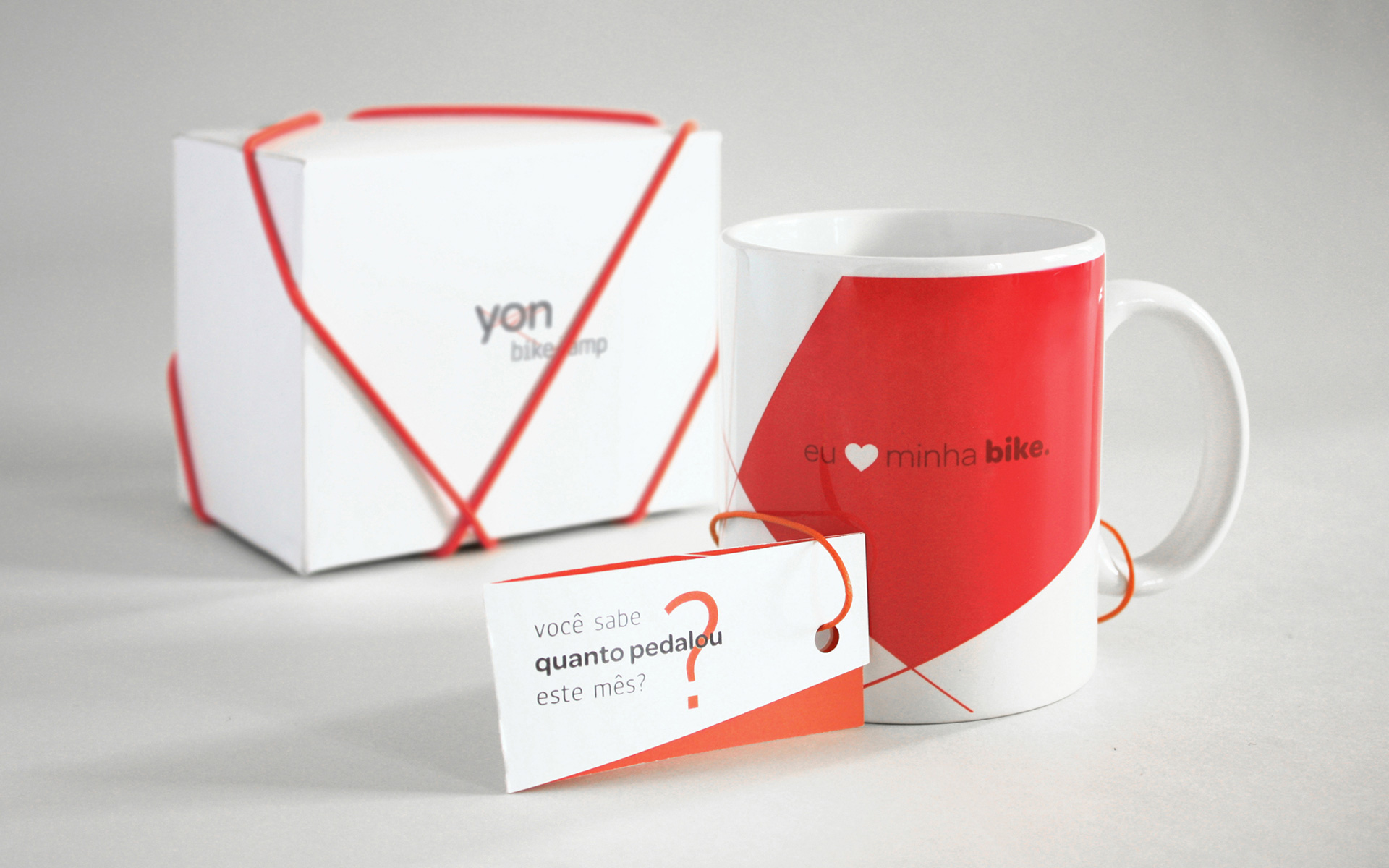
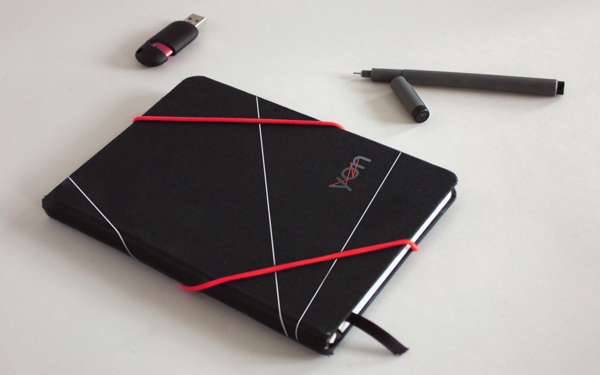
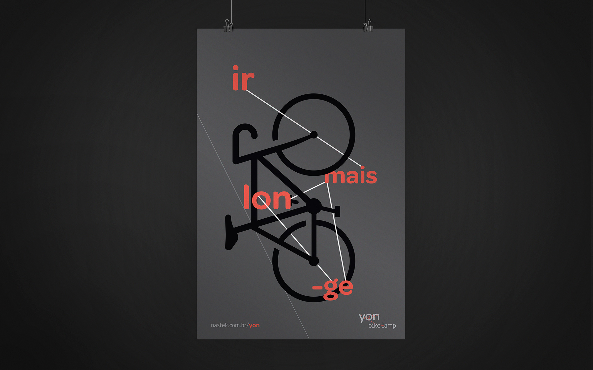
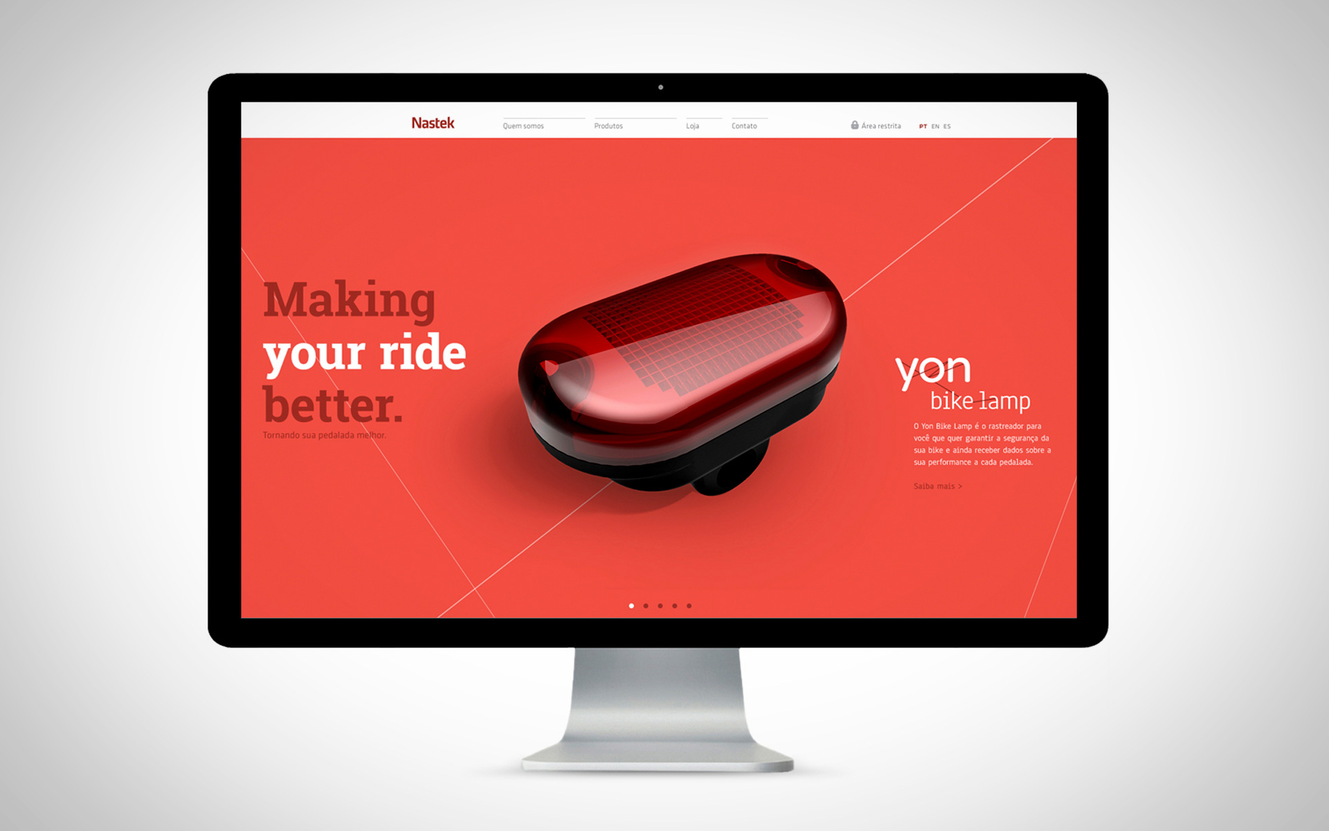
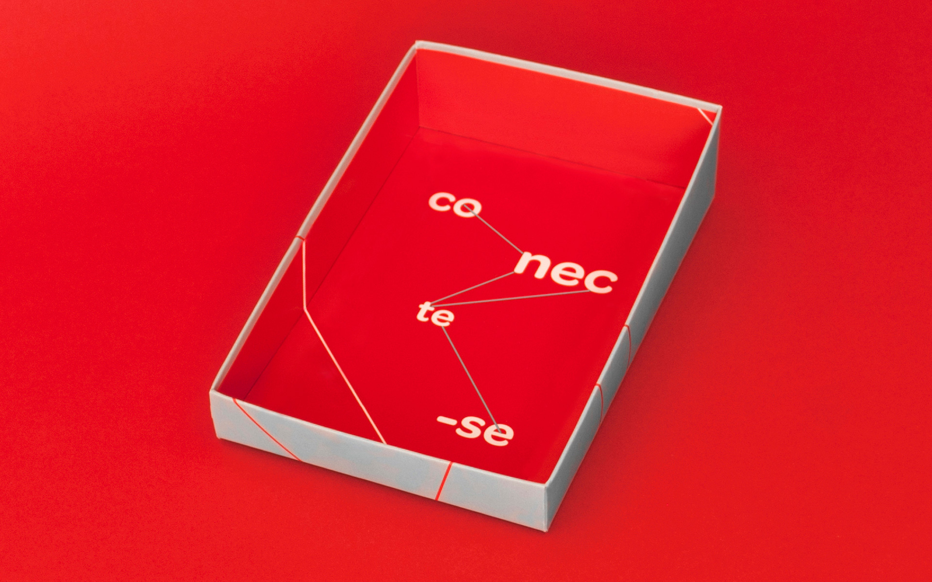
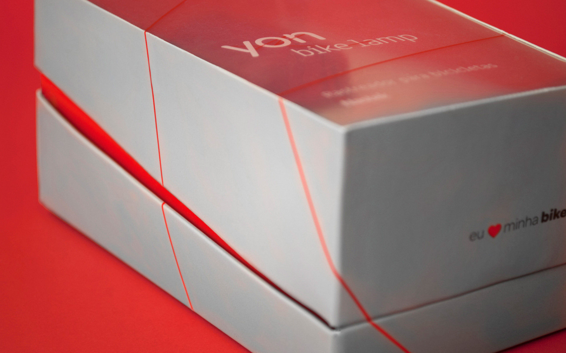
“The project that originated the brand was supposed to fulfill a gap left by the competitors of the niche: none of them positioned their products in a personal, close or friendly manner. The chosen name, ‘Yon’, means distant but within sight. Short, direct and easy to pronounce, it fits the strategy perfectly bringing personality and poise to the brand. The entire identity was developed under the concept of all connected so that Yon was a flexible and dynamic brand, that suggested movement, speed and connectivity, which are the main attributes of the trackers. The logotypes are composed by the name Yon plus the respective complements, indicating the different uses: trackers for bikes, pets, senior citizens. Several lines of different colors cross the logotype and the visual identity connecting letters, words and images. The lines, the colors and the simplicity of the logotypes allow a variety of brand applications without losing its identity, on the contrary, reinforcing its presence as a multifaceted brand.”
Leave a Reply