BTL Brands have designed the identity for The Chatsfield – a fictional luxury hotel chain, and the setting for a new cross-platform romance series by publisher Harlequin/Mills & Boon.
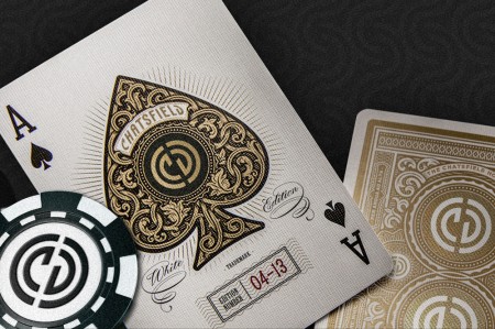
“We were given the enviable task of designing the identity for the hotel, building the website, and creating a series of luxury promotional products to be sent to journalists and fans on launch day.
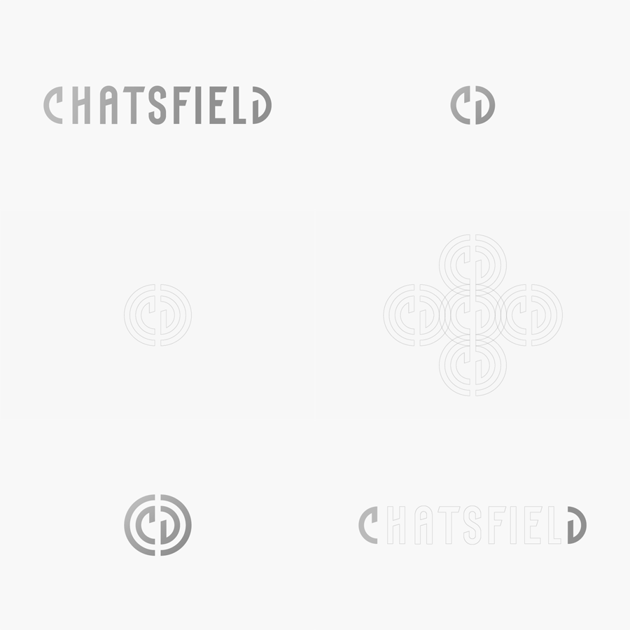
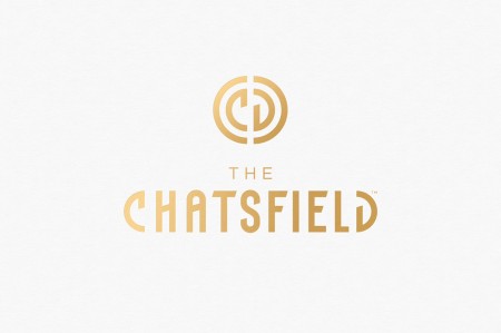
We wanted the hotel to have a modern look & feel, but inspired heavily by art deco and top luxury brands like Chanel. The custom typography folds neatly into itself to create an iconic logo, which naturally becomes the centrepiece of the identity and packaging.
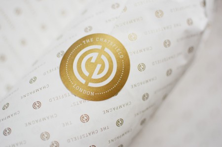
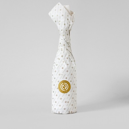
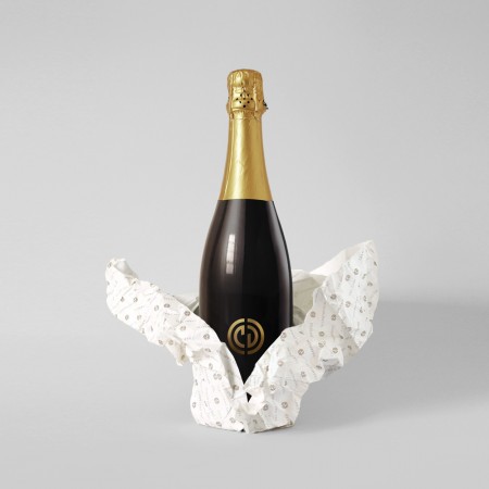
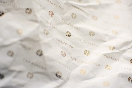
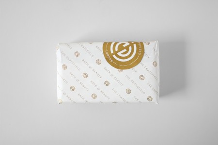
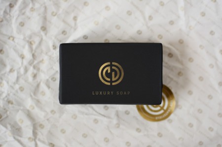
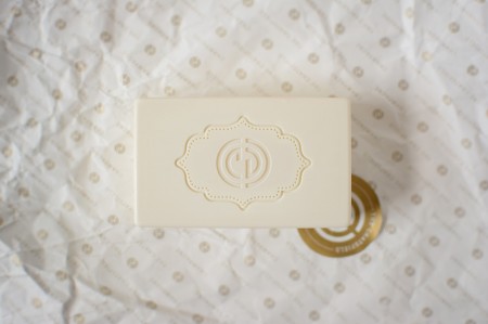
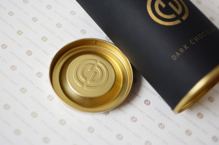
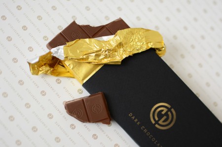
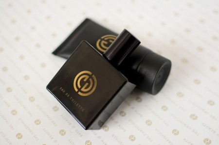
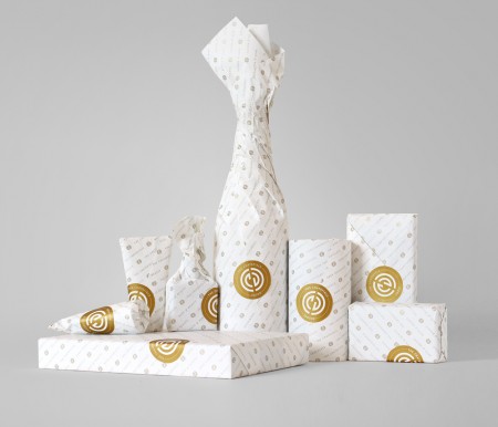
The packaging system needed to be flexible, luxurious and iconic (yet achievable on a very small budget). Black, white & gold are recurring motifs in luxury branding, making it the ideal colour scheme to give The Chatsfield credibility. The solution was minimal black packaging, wrapped in a delicate white bible paper, impeccably printed with gold ink and sealed with a gold sticker. No ordinary printer could get our delicate wrapping paper through their machine, so each individual sheet had to be screen printed by hand. The result is satisfying to unwrap and truly exclusive.” – BTL Brands (London & Barcelona)
You can read more info about the project on Wired.
Leave a Reply