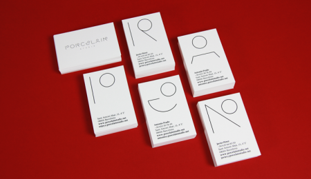
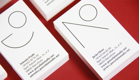
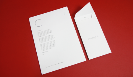
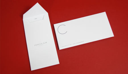
The branding for Porcelain Studio, created in-house.
They also provided this overview:
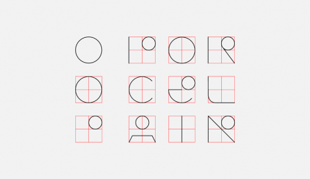
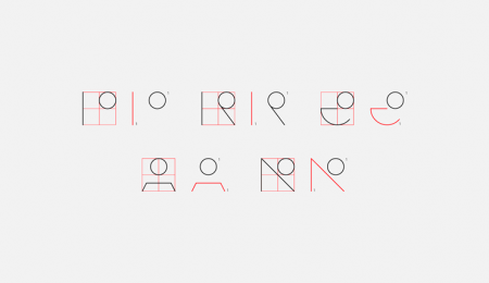
“Our logo reflects the concept of dichotomy, the division in two parts of each one of its letters. In it we express the idea of union formed by both members of this project, Javier Pérez and Antonio Prado. Every piece works as a symbol that identifies us and makes us be what we are.”
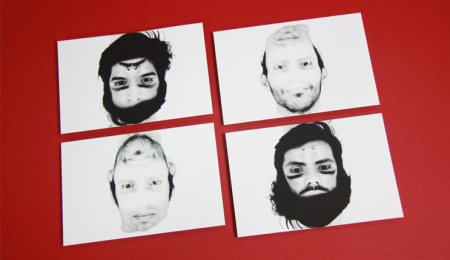
“The corporate identity of the studio is focused on the search for the fundamental. Experiencing searching the functionality of the elements of the graphics and doing without any ornamentation. Completing the design on something clean, crisp and clear. Both the stationary and the self-promotion photographs are based on the concept of dichotomy.”
Leave a Reply