DC Comics

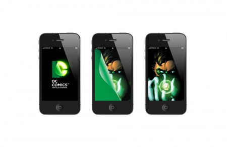
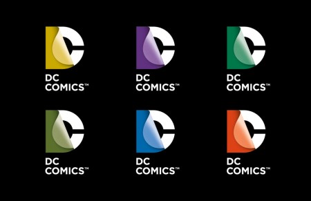
DC Comics have revamped their brand with help from Landor Associates.

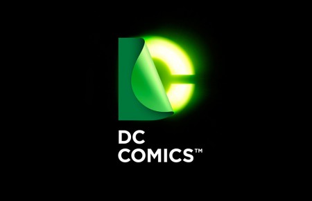
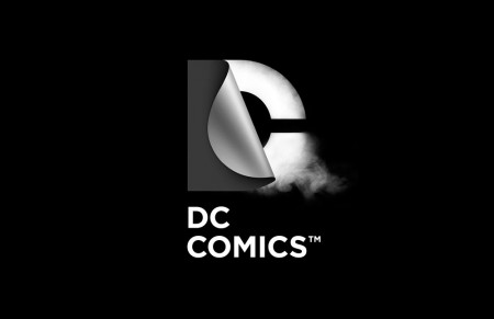
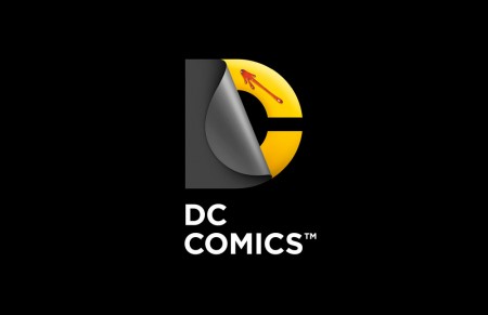
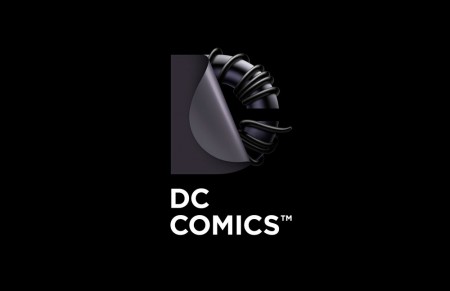
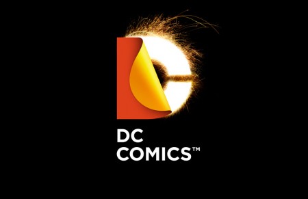
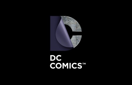
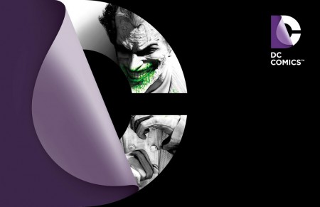
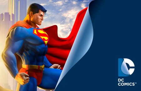
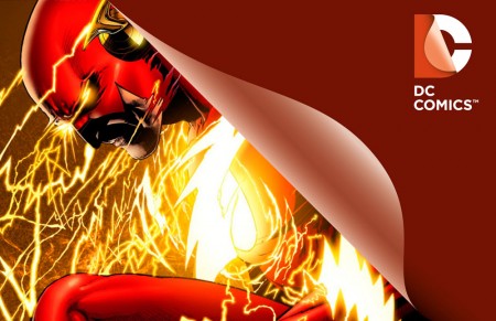
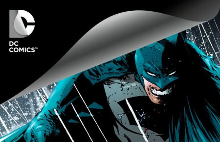
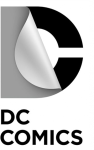
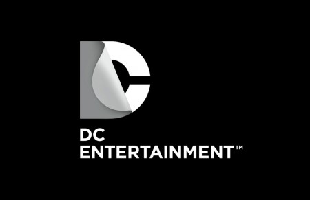
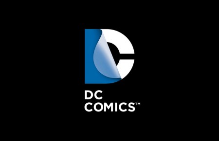
As explained on the DC Comics blog, “the design of the new DC Entertainment identity uses a “peel” effect – the D is strategically placed over the C with the upper right-hand portion of the D peeling back to unveil the hidden C – symbolizing the duality of the iconic characters that are present within DC Entertainment’s portfolio.”

A good discussion on the rebrand can be found on the Creative Review blog, and for those interested a history charting the DC Comics brand logos from 1940 onwards can be found here.
Posted

in

by

Tags:

Comments

5 responses to “DC Comics”

  1. Graphic Design Sheffield Avatar

    I’d really love to see how a non-gradient version of this logo would work?
    Love the logo (at the minute, not sure if it has legs though), just not sure on the application of it. Think the page turns on the batman/superman scamps could have been worked better.

  2. robb Avatar
    robb

    Sorry, I can’t understand this one.

    ♦ Visually speaks nothing of adventure/action found in DC comics.
    ♦ Looks more like a pealing sticker than a turning page.
    ♦ The reliance on the gradient also makes it awkward to scale down.

    But most notably to me:
    http://images.wikia.com/logopedia/images/8/8e/Discovery_History_2010.png

  3. larry Avatar
    larry

    another example that most graphic designers are just a bunch of gossip p^$sies. sorry for the language

  4. camus Avatar
    camus

    awesome!

  5. Andrew Avatar

    This is brilliant! Such a simple idea executed so beautifully! Bravo

Leave a Reply

Your email address will not be published. Required fields are marked *